This brand identity was created for Nicole Gollihar, a New Mexico–based photographer with a background in ophthalmology. The goal was to design a logo that is not only visually striking but deeply personal, rooted in both the craft of photography and Nicole’s connection to vision, clarity, and the warm tones of the Southwest.
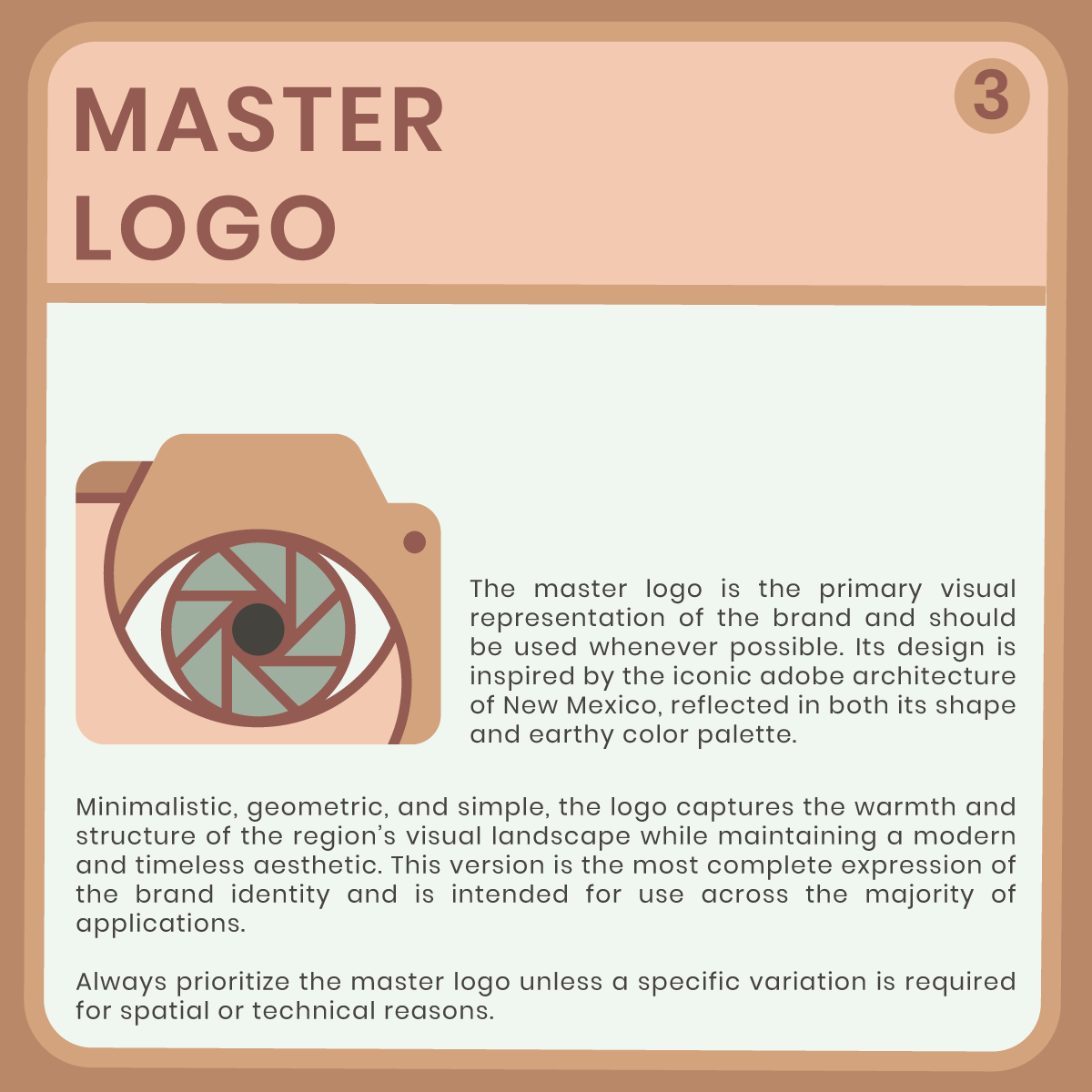
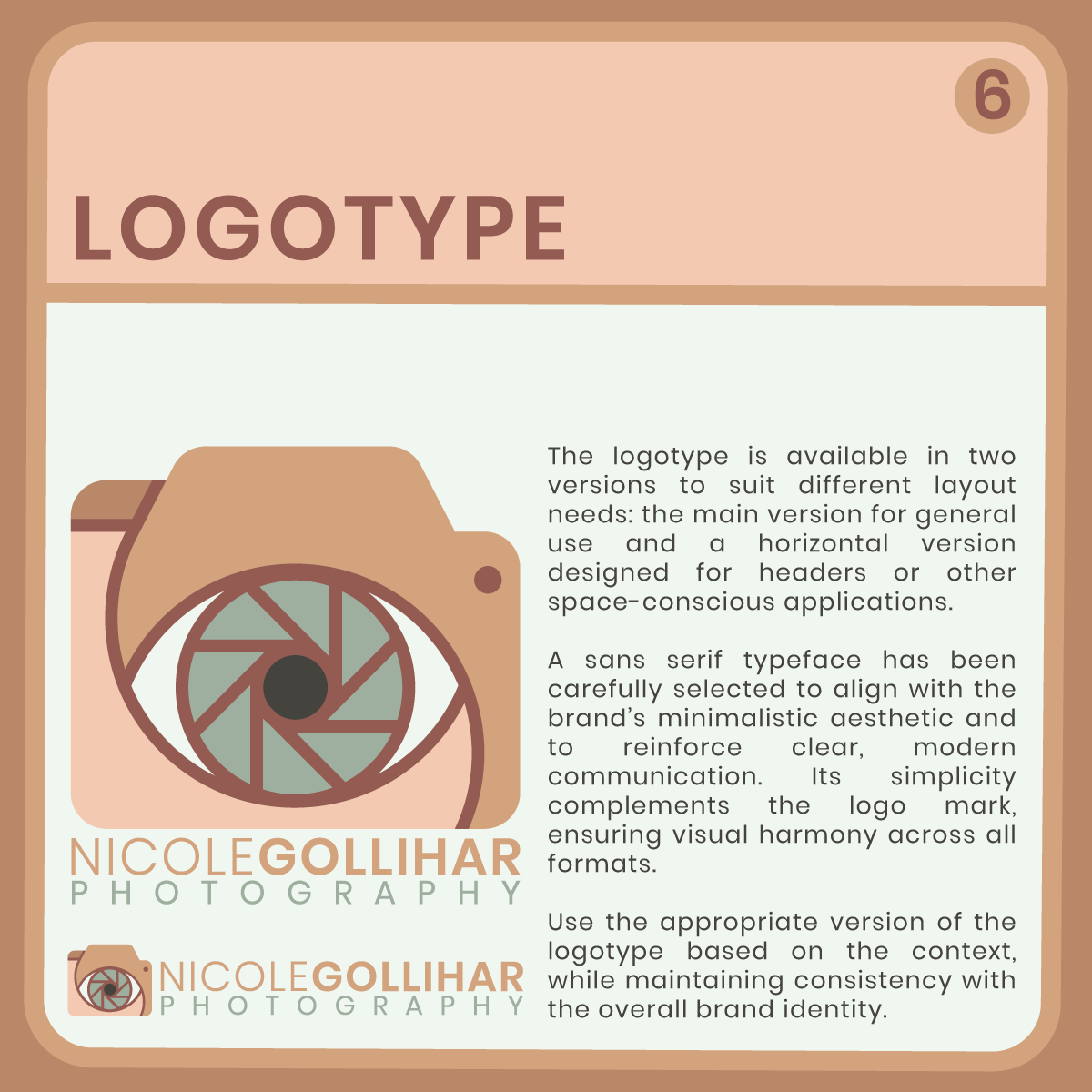
The final mark is minimalistic and geometric, blending the symbolic forms of a camera, eye, and shutter. These elements subtly reference Nicole’s dual expertise in photography and eye care, resulting in a logo that is both conceptually rich and visually simple.
The color palette draws inspiration from New Mexico’s adobe architecture, featuring warm, earthy tones that reflect the natural landscape and evoke a sense of grounded creativity. Clean sans-serif typography complements the mark, preserving the brand’s modern and approachable feel.
This logo is designed for versatility, working seamlessly across print, digital platforms, and marketing materials, always maintaining clarity, warmth, and professionalism.